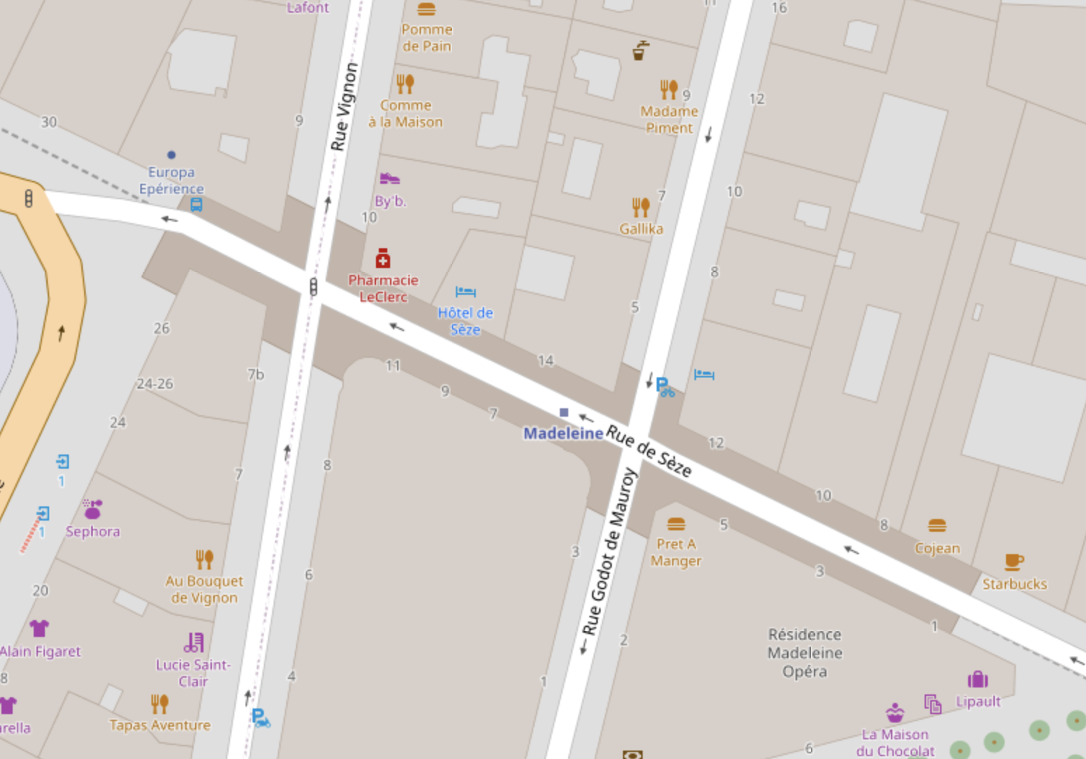
Hi, I live in Paris and i got problem with the visualization of a couple of underground metro stations like this one. As a map "consumer" i found "ugly" this "rectangle" under the street... I know that data is more important than the representation but still do you know a way to make it more user friendly? Thanks a lot. Djiril
asked 14 Jun '22, 13:51 Djiril |
2 Answers:
As it's underground, I'd remove the building tag from all the stations. Edit: https://overpass-turbo.eu/s/1jsk I'd also remove two of the Madeleine stations as it contravenes this practice: https://wiki.openstreetmap.org/wiki/One_feature,_one_OSM_element What tags are required to return all 308 Paris Metro stations? https://overpass-turbo.eu/s/1jst The above returns just 27 stations. answered 18 Jun '22, 16:26 DaveF edited 19 Jun '22, 16:33 1 Why? (19 Jun '22, 05:50) Kovoschiz |
Hi Djiril, good question but what do you mean by the illustration of a Paris Metro system. Which do you like better this one, https://www.openstreetmap.org/#map=19/52.51790/5.06688 or the station ? You could go back to nodes if you like, the earlier OSM times, but we are past that one. The original mapper of the station has just drawn a simple square the easiest way, but it is covered by the priority buildings have over other items. answered 15 Jun '22, 11:10 Teek |


There is an rather old and lengthy issue about the rendering of underground buildings: https://github.com/gravitystorm/openstreetmap-carto/issues/552