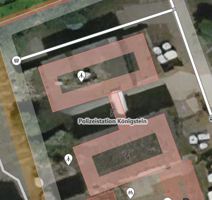
Our local police station now contains two police person icons, as can be seen in the screenshot: The second one has been entered by yours truly who missed that there already was one. (The name of the police station also wasn't visible then. Apparently, it only is displayed for zoom factor ≥ 19, and not when the southern building is selected.) So, how can one make the icon more visible? This boils down to three questions:
━━━━━━━━━━━━━━━━━━━━━━━━━━━ Aside: Finding the parent node My original reason to to ask a question about this was that, while I saw the icon and the name in the editor, I couldn't select it. I now figured out a way; here it is:
If anyone has an easier way, please feel free to write it in a comment. asked 07 Oct '21, 14:23 SebastianHelm edited 07 Oct '21, 14:27 |
One Answer:
Label placement is generally an issue for the renderer to solve and it is generally advised that mappers don't map for the renderer. That being said part of the issue here might be that the police station appears to be tagged twice (also discouraged), once on way 123329366 and once on way 946905787. This may be causing the odd choice of label placement. Without personal knowledge of the station I can't say for certain which is the correct way to hold this information, but the police station tags should only exist in one location, possibly even on a way encompassing some of the grounds if they are also considered to be part of the amenity. answered 07 Oct '21, 18:24 InsertUser |


Yes, it's tagged twice, which was a mistake, as described in the original question.
Good point, though, about “don't map for the renderer” I hadn't considered this rule since I felt the connection between the two buildings was a good place regardless of the renderer, but ultimately, I agree that it should be the task of the renderer to make such decisions. So I'd like to replace #1 with the following:
The Android editor Vespucci provides an option to show icons for building areas as well as points, but I'm not sure that iD does anything similar. I've just checked in two other editors & both fail to display an icon for things mapped as areas, so this may be something suitable for an enhancement. The other two editors use the MapCSS styling language so may be easier to customise.
I am fairly sure the answer is "no".
I think you are saying that in this example, you could suggest a placement that would be more visible relative to the background imagery. But that is based on a particular imagery provider, and an image taken on a certain date under certain lighting conditions. Other mappers may choose other background images, and even the imagery you are using will be updated at some time. So I think it would hard for mappers to consistently find "better" placements, if that option was ever offered.
Similarly on your question about making police stations more visible in any view - importance depends very much on the purpose of the renderer. A police station may be considered of very low importance in a map of railway infrastructure, for example. So really I think it has to be a renderer decision.
In case it helps, when I use ID I have the standard OSM view (not edit view) open in another tab. I use this, combined with the query tool, to understand the main features that already mapped and identify where I might want to add something. I think you would have seen the police station quickly if you had been looking at the standard layer.