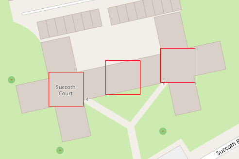
Hi, The building I am asking about has a shape of two plus signs merged side by side. After I added its name I expected it would appear roughly in the middle but instead, the name is shifted to the left, like it was over one of the 'plus signs'. What is the reason for that? Am I missing something important? https://www.openstreetmap.org/#map=19/55.95024/-3.24121 Thanks, Michal asked 22 Dec '18, 18:53 michau |
2 Answers:
This is how the Mapnik works with "interior" algorithm. It tries to find the point which is the most distant from all the borders and then adds a bit of gravity towards geometric center. I was involved in the process of changing this algorithm, because the old one had some flaws, which resulted in showing labels outside the area, which was a problem that was bugging me, because for example Lake Victoria was rendered somewhere on the ground. https://github.com/gravitystorm/openstreetmap-carto/issues/1465 Finding centroid is not trivial task and it depends on the shape heavily. What works better on some of them, is just strange in some other cases. I have reviewed about 100 of different shapes when giving a feedback to the developer, and there was no clear winner and this algorithm was just sane enough. answered 22 Dec '18, 23:57 kocio |
While I don't know how the renderer works, my guess is that it is searching for the biggest square area to place the label in. And this happens to be at the center of the western cross.
answered 22 Dec '18, 20:50 pbb |

